


CADAVINCI STUDIO
A SCALABLE BRAND SYSTEM
Designing a strategic identity for a branding studio in the AI era.
Brand Strategy · Visual Identity · Brand System · AI Workflow
Full brand guidelines available upon request
THE PROBLEM (BRAND PAINS)
In a landscape where AI can generate visuals instantly, branding has become faster, but not smarter.
Many brands rely on trends, templates, and automated outputs, resulting in identities that feel polished but lack clarity, direction, and differentiation.
The challenge was not to create another visual identity, but to define a system that could think, scale, and remain intentional over time.

Most brands today are built to look good.
Not to make sense.
SPEED IS NOT STRATEGY
AI can generate images in seconds, but it cannot define meaning, positioning, or intention.
The real opportunity was not to reject AI, but to reposition it: as a tool that enhances thinking, not replaces it.

SOLUTION & CONCEPT
CadaVinci Studio was designed as a structured brand system that integrates strategy, design, and artificial intelligence under a unified logic. Rather than treating branding as a purely visual exercise, the approach focused on building a scalable framework where every element serves a clear purpose.
Guided by the concept of:
“INTELLIGENT BRANDS WITH SOUL”
the system balances analytical clarity with creative expression, ensuring the brand remains both distinctive and adaptable. AI is integrated as a tool to accelerate exploration and enhance consistency, always directed by human judgment and strategic intent.
The result is not just an identity, but a system designed to think, evolve, and communicate with precision across every touchpoint.
A brand built as a system • Not an outcome
A SHARED FORM
The skull is the one element we all share, regardless of background, identity, or context. It represents equality, inclusion, and a common ground where everything begins.
Within CadaVinci, it also introduces a layer of irreverence, used not to disrupt, but to question the expected and avoid generic solutions.
THE SKULL IS NOT DECORATION

Designed to be recognized without explanation
THE WORLD DOESN’T NEED MORE LOGOS. IT NEEDS BETTER THINKING
BRAND IDENTITY
The CadaVinci logo system is designed as a modular identity framework, allowing the brand to adapt across contexts while maintaining clarity, recognition and visual strength.
Each variation serves a specific purpose, from full expression to minimal presence, while staying consistent with the brand’s core:
Intelligence, structure and distinctive creativity
Together, these components form the face of the brand: a living system that evolves without losing its DNA.
DESIGNED TO BEHAVE, NOT JUST TO APPEAR
The identity was built as a modular system where each element has a defined role:

Primary Logo
Expression

Horizontal Logo
Functionality

Brandmark
Recognition

Stacked Logo
Flexibility

Wordmark
Simplicity

Monogram
Minimal presence
This hierarchy allows the brand to adapt across contexts while maintaining consistency, clarity, and recognition.
EACH LOGO VARIATION IS NOT AN ALTERNATIVE, IT’S A ROLE WITHIN THE SYSTEM
STRATEGIC INSIGHT
This is not just a logo system. It’s a brand behavior system.
Each variation allows CadaVinci to:
-
Act like a premium studio
-
Scale like a modern brand
-
Adapt like a content-driven identity
SELECTION GUIDELINES
When choosing which logo to use, prioritize:
-
Use Primary Logo when: you want maximum brand impact
-
Use Horizontal Logo when: you need clarity and readability
-
Use Stacked Logo when: you need balance in vertical formats
-
Use Wordmark when: you want clean, bold communication
-
Use Brandmark/Symbol when: you need recognition without text
-
Use Monogram when: space is extremely limited
A CONTROLLED VISUAL LANGUAGE
The visual identity was designed to guide attention, not decorate.
-
Color is used with intention, highlighting key elements rather than overwhelming compositions
-
Typography creates hierarchy and clarity, reinforcing the brand’s structured nature
-
Iconography balances precision with subtle disruption, avoiding generic outcomes
Every element works together as part of a cohesive system, not as isolated design decisions.

Cadavinci Studio’s color palette is not aesthetic-first but behavior-driven: yellow captures, turquoise organizes, and neutrals stabilize, creating a controlled visual rhythm that reinforces the brand’s philosophy of “constructed, not decorated”. Black is used as a neutral base to enhance contrast and hierarchy.
This approach aligns with advanced visual prompting principles where clarity, hierarchy, and intentional contrast produce more coherent and believable outputs , ultimately positioning Cadavinci Studio as a brand that communicates authority, precision, and strategic direction through every visual decision rather than relying on stylistic excess.
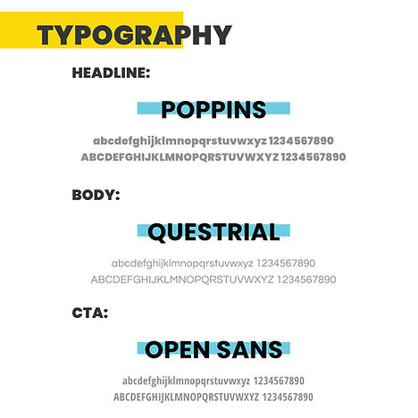
This typographic selection is not random; it is a 3-layer system:
-
Layer #1: Strategy / Authority (The system thinking layer)
Font: Poppins • Meaning: Structure, intelligence
-
Layer #2: Communication (The human intelligence layer)
Font: Questrial • Meaning: Clarity, human understanding
-
Layer #3: Action (The execution layer)
Font: Open Sans • Meaning: Execution, usability
Together, they reflect our core belief: intelligence is not decoration, it’s system.
ICONOGRAPHY
A dual-color, grid-constructed icon system that represents ideas through structured forms, with subtle disruption (asymmetry) to avoid generic perfection.
PATTERNS
Cadavinci Studio’s pattern system transforms the brandmark into a modular, repeatable visual language that scales identity beyond singular logo usage into a dynamic surface system.
By leveraging diagonal flow, high-contrast repetition, and controlled rhythm, these patterns create a sense of movement and strategic tension, avoiding static compositions and reinforcing a forward-driven, disruptive brand attitude.
The alternation between yellow, cream, and turquoise over dark charcoal establishes a hierarchy of attention while maintaining cohesion across applications, allowing the system to flex between bold impact and subtle texture depending on density and scale.
Importantly, the patterns are not decorative fillers but structural assets: they encode recognition through repetition, build visual memory, and enable the brand to occupy space consistently across touchpoints, turning every surface into an extension of Cadavinci’s identity rather than an isolated design moment.

MESSAGING & TONE OF VOICE
CadaVinci Studio exists to challenge the way brands are built in the AI era.
Most brands today are chasing trends, reacting to algorithms and producing generic visuals with no real direction.
CadaVinci Studio takes a different approach: we build intelligent brands with strategy, clarity and soul, not just content that looks good for a moment.
This tension drives all communication and positioning.

WE HELP BRANDS GO FROM UNCLEAR, GENERIC AND DIRECTIONLESS,
TO INTELLIGENT, STRATEGIC AND IMPOSSIBLE TO IGNORE
GRID SYSTEM • LOGO CONSTRUCTION
STRUCTURE GUIDES EVERYTHING
The grid system was not treated as a layout tool, but as a thinking framework.
Inspired by geometry, proportion, and digital systems, it ensures that every composition feels intentional, aligned, and structured.
Rather than limiting creativity, the grid provides the foundation that allows the brand to scale without losing coherence.
GRID PHILOSOPHY
The grid is not just a layout tool. It is:
-
A thinking system
Every design decision should feel:
-
Intentional
-
Aligned
-
Structured


SOCIAL MEDIA STRATEGY
CadaVinci Studio uses social media as a strategic ecosystem, not just a content channel.
Each platform has a specific role in the growth system:
-
TikTok → Discovery & Reach
-
Instagram → Authority & Conversion
-
Facebook → Passive Presence & Support
CORE PRINCIPLE
We don’t create different brands per platform.
We express the same thinking in different formats.
LOGO USAGE
-
Primary Logo → announcements / major posts
-
Wordmark → content posts
-
Symbol → watermark / avatars / reels

AI GENERATES
IT DOESN’T THINK
SYSTEMS DEFINE DIRECTION
THE FUTURE OF BRANDING ISN’T HUMAN VS AI.
IT’S HUMAN INTELLIGENCE AMPLIFIED BY TECHNOLOGY.
AND THAT’S EXACTLY WHERE WE WORK.
DESIGNED FOR REAL WORLD USE
The system was applied across multiple touchpoints to ensure consistency, flexibility, and clarity in different contexts.
Rather than adapting the design each time, the system allows the brand to behave consistently, while remaining dynamic and expressive.


STATIONARY


APPAREL


AI AS A TOOL,
NOT A DECISION MAKER
Artificial intelligence was integrated into the workflow to accelerate exploration, test visual directions, and improve production efficiency.
However, every output was guided by human judgment, ensuring the system remained intentional, coherent, and aligned with the brand’s strategy.

A BRAND DESIGNED TO THINK,
NOT JUST TO EXIST
The result is a cohesive brand system that:
-
Maintains consistency across touchpoints
-
Adapts to different formats and contexts
-
Communicates with clarity and intention
More than a visual identity, CadaVinci Studio functions as a living system, built to scale, evolve, and remain distinctive in a landscape of increasingly generic brands.